- Event Promotion Tips
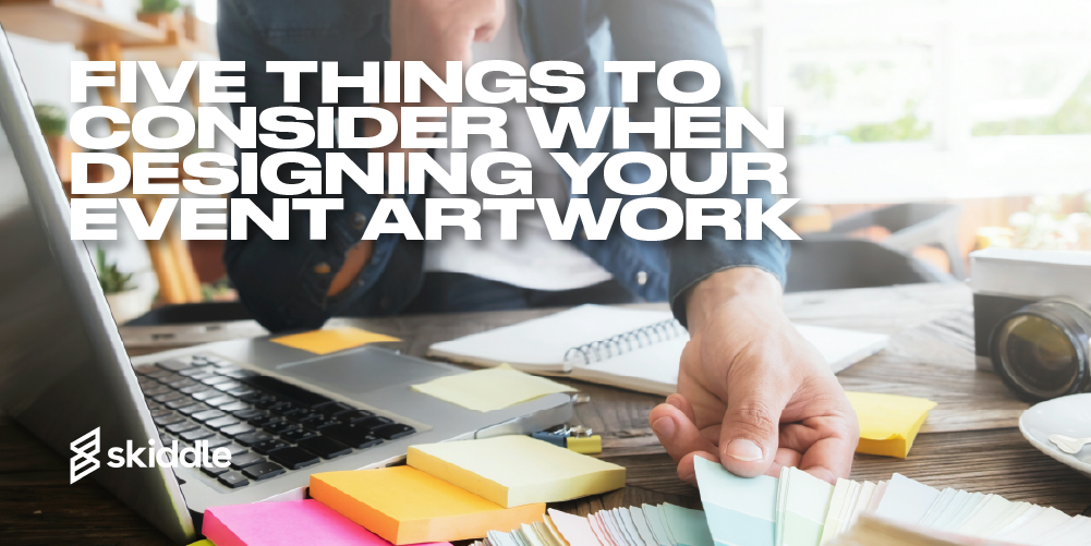
Five things to consider when designing your event artwork
-
By Ryan Moss
- 20 Mar 2023
- 7 min read
Event artwork is important. It’s the first contact people will have with your brand, giving them an idea of what your event is all about.
It’s tempting to think of the logo and stop there. However, the logo is just the beginning. The colours that you pick for your logo, event flyers and social media assets will all play a part in your branding.
If you decide to branch out into merch, you’ll have to consider how to adapt your branding. It’s crucial to have a uniform design across the board. You want people to look at your brand and say: that’s an event I recognise.
But how can you do this? Well, there are lots of moving parts that go into creating event artwork and branding. We’ve picked out five in the article below.
The identity you want to convey
First up? Think about the type of event you’re organising.
Whether it’s a logo, event flyer or announcement graphic, the artwork for your event needs to relate to the event’s genre. Rave flyers from the 90s conveyed a sense of the otherworldly, with garish colours and sci-fi imagery. The artwork represented a new scene that was full of expression.

So artwork for a family-oriented event with heavy metal-style text won’t make sense. That’s an extreme example, but the point still stands.
For an event like this, the event details are crucial. You might want to use clean, serif typefaces so people can easily find where and when your event is.
Once you’ve got an idea of the identity you want to convey, you can start to think about colours and typefaces. This is how you’ll take your event artwork concept from abstract to reality.
Typefaces and fonts
There are some differences between typefaces and fonts.
Take Helvetica, for example. That’s the typeface. The variations, bold, italic and so on, are the fonts. Typefaces are split into different categories. You’ve got Serif, Sans Serif, Script and Decorative.
Serif typefaces have decorative lines and tapers, while Sans Serif ones have clean lines. Script typefaces have curves and look like joined-up handwriting, while Decorative typefaces are typically designed to be attention-grabbing.
But why are they important?
Well, the typeface you use can evoke different moods.
In the past few years, lots of brands have switched from serif to sans-serif typefaces. The edges are smooth and evoke a feeling of sleek style.
Readability is also a factor. Think about it. A gothic font with lots of flourishes would look great for the name of your event. But if you’re designing a flyer, making this font smaller is likely to make the text harder to read.
Whatever you go with, spend time researching different typefaces. Try to strike the balance between readability and style in your event artwork. You want a typeface that conveys the image you want to portray, looks great and is easily readable by attendees.
Colours
Colour theory can help bring your brand identity to life. For example, a colour wheel can help you pick complementary, monochromatic or analogous colours. This can then be the base for the rest of your event artwork.
Different colours evoke different emotions. After all, there’s a reason why people use the term ‘seeing red’. It’s the shade of passion and intensity.

Similarly, a black-and-white colour scheme can help convey a sleek look in your branding. If your event is all about underground techno, this might be the choice you make.
Or, maybe you want to go for a yellow background. Pairing this off with a crisp-looking, black, sans-serif font for your text gives you the best of both worlds. You’ve got a striking background to grab the attention and an easy-to-read font that makes all your event details crystal clear.
The structure of your event artwork
When designing event artwork, the structure is paramount.
There will be a lot of details, and they need to be accessible to the eye. You don’t want to clutter the space with unnecessary things. So, you could consider sectioning off each part of your event information.
The title of your event might go at the top. Along with the design, this is what will draw people in. Then, the venue details, date and time of the event might be underneath on the left side of the poster. Ticket prices might be in the centre, while the names of the performers might be on the right-hand side.
It’s not a hard and fast rule, though. For example, you might want to draw people in with the names of the performers. So, they might be in the centre of the poster in the biggest size. Then, you can place the other information underneath in a slightly smaller font.
Take a look at other event posters, too. See how they’ve put theirs together and get some inspiration. Whichever route you go down, remember: the flyer needs to make sense to the eye. If the design is logical, it’ll work.
Optimising for visual awareness on the Skiddle website
When you’re listing on the Skiddle website, having an image is likely to help you gain attention from potential. We have four million users per month. So, uploading an asset for your event is a no-brainer.
There are some things to consider, though. It’s best practice to use an image or a logo. Lots of text at a small size can be hard to read. However, the Promotion Centre lets you upload secondary assets, too. So, you could have your event logo as the main image, with the flyer showing further down the listing.
Ensure that your image is of high quality. Any pixelated or poorly cropped assets will be flagged by our Customer Support team. If your listing gets flagged, we’ll suspend it from the website until you provide something of better quality. So, the longer you wait, the more time potential attendees won’t be able to buy tickets.
Click here for more information on image regulations in the Promotion Centre.
Got a question you need an answer to?
Give us a call on 03333010301 or ask us a question over on the Skiddle Promoter Twitter account by clicking or tapping on the button below. Alternatively, you can also find a list of our most frequently asked questions over at https://help.promotioncentre.co.uk