This is a guest blog by Keir DuBois, co-owner of Tight Ship, a creative partnership offering complete graphic design services for events and conferences, including branding, print, digital, and environmental.
You’ve booked a venue, wrangled a formidable lineup of guest speakers, and hired the sharpest, most professional production crew for your special event. Now all you need are attendees, and an effective way to spread the word!
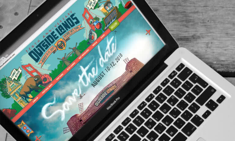
Your event’s website—specifically, its home or landing page—is a critical tool for raising awareness and increasing registration. Its design should help achieve those goals with a coherent identity and messaging, an organised information hierarchy, and compelling visual imagery. The following strategies can help you create a page with a clear call to action for stoking interest and driving ticket sales.
Identity
Your event’s landing page should represent its brand by showcasing a unique identity. The best event pages express this identity both visually and verbally, with well-paired typefaces and easy-to-read layouts that help close the sale with an intuitive registration process. That’s called hierarchy—design that directs the user along a specific path toward a single goal.
A good visual hierarchy arranges content into what the viewer should see first, second, third, and so on, via powerful imagery, contrasting colours, or relative size of each element. Good verbal hierarchies work in the same way: a reverse funnel of copy presenting essential information first (event name, date/time/location, cost) and rewarding further engagement with richer details (speakers, activities, logistics).
Integrated hero video and identity for Vue.js Amsterdam
Be flexible but tasteful when deploying your event’s identity. A custom app or website may need to gracefully compromise a little (maybe don’t use that unique, custom font or that huge photo from the print program or thirty colours per screen) to favour comprehension or download time. Beauty and reliability aren’t mutually exclusive, so your page design should reflect that, for the sake of usability.
Messaging
Balanced hierarchy, trending colour, stratified type, and unique brand promise for HOW Design Live
An event page’s messaging works hand in hand with its information hierarchy. Attendees increasingly expect festivalisation: interactivity, entertainment, and restorative downtime and not just a bigger or better bang, so effective event page messaging should support a user-defined experience based on trust.
Your design can foster that trust by creating authentic emotional connections between your attendees and their event experience. Define that experience with visual cues, and support those visuals with descriptive copy: what will your attendees learn at this event? Who will they become afterwards?
Consistent messaging sparks interest by highlighting the event’s brand promise (a great experience), which can fuel word-of-mouth (social proof, testimonials) and boost conversions (registration, ticket sales). Delivering on that promise turns attendees into advocates, cultivating future engagement and reinforcing the brand—which is especially critical for recurring events.
Colour
Big Omaha does a lot with two colours
Event pages seeking to inspire meaningful, substantial, and holistic event experiences should rely on a palette of three to five emotionally resonant colours. Shades of crimson, navy blue, bright gold, burnt orange, intense magenta, or (most frequently) royal or ultraviolet purple are still dominating palettes both in print and on screen.
Rich colors evoke a rich experience, but colours associated with specific emotions (cool for precision or tradition, warm for innovation, neon for excitement) can also underline that experience. Contrasting colours for body copy, like black text on a white background, make for easy skimming and quick comprehension.
Typography
Two typefaces and three colours help cement Boston Calling’s no-frills identity
The most informative event pages employ copy that’s understandable regardless of surrounding (literal or figurative) hubbub. Simplified typography and iconography allows accessible navigation, and consistently-applied type maintains the brand’s visual cues in any setting. On screen, that means functionality – mostly sans-serif font sets for subheads, body copy, and buttons – topped off by heavier display typefaces or even hand-lettered type for headlines.
As for overall copy, fewer words (but the right words) is still the rule. Properly stratified typography (progressively darkening colour shades or descending weights for headers, subheads, body copy etc.) will contrast well for more substantial content like detailed program descriptions or guest speaker bios.
Imagery
Modular illustration elements on lampli.be
Compelling imagery will strengthen any event page’s brand, message, and call to action. Professional photography rightfully dominates most large conference, concert, and festival pages—but many events of varying sizes may also use modular imagery. These illustrations or icons may appear throughout the site, either as passive wallpaper or overtly associated with certain event aspects or actions.
For banners or other hero-level imagery, many brands are scaling back their aesthetic footprint in favour of more dynamic content (social media walls or video sizzle reels). Visually, that means simpler logos with fewer colours (if not completely all-one colour) and subtler placement. The most common iteration of this is white logos (or text, or icons) overlaying wildly colourful imagery or video.
Simple one-colour identity and content laid over photography for Bottlerock 2018.
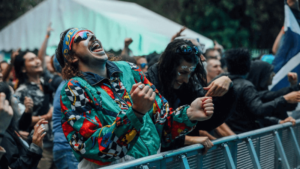
Whether your event page uses photography or illustration, it’s best to hire a professional. Stand out from thousands of amateur Facebook banners or poorly-lit snapshots of exhausted people. Creative professionals can make the most of less-than-ideal conditions, so your event’s sessions or evening after-parties always sport shareable imagery!
Summary
Keeping up with the latest, most valuable event page designs isn’t always on event professionals’ radar when they’re neck-deep in logistics. Your event page may not be the first point of contact a potential attendee will see, but it should absolutely be the most authoritative for anyone dropping in from a social post or email link.
Savvy event professionals know that the best events are those at which attendees anticipate a fun experience before going, enjoy a great time during, and share their memorable stories after each event. Successful event pros know their event page is a critical component to reach those goals.