
Skift Take
No one wants to recreate the wheel, yet so many templates for event presentation ppt slides look like something out of the 90s. If you’re nervous about your next event presentation or proposal, we hear you. We’re here to help.
Want design tips to make your event slides stand out?
Or maybe you just don’t want the extra trouble of putting it all together, and you want an event presentation template so you can get to work right away.
Done and done.
We not only have professional information for you on what makes a winning presentation design, but we’ve also compiled this handy information in examples of slide deck using the best practice tips we have discussed and introducing useful content for eventprofs.
Free Event Presentation Templates and Guides
As an event planner, you often have to sell clients and stakeholders on your ideas. Sometimes, you need to get buy-in and top-down support for the things you want to implement, and other times, you just need to bring people up to speed quickly.
Ideally, this article will make you feel confident in creating your own presentation templates, but we know you’re busy. Alternatively, you can download ours for free.
We’ve bundled 3 ppt template packages into one free download to help you prepare for some of the most common event presentations you’ll need to make. These professional templates are here to take the stress and worry of template design off your plate, so you can focus on the content of your presentation.
Here’s a preview of what’s in store:
Event Proposal PPT Package
Have a big event proposal coming up? This package includes the following:
- Sequoia style pitch deck to help you communicate your vision in your presentation
- Keynote proposal template to let you pitch in Keynote instead of Powerpoint
- Event proposal template to help you formulate your ideas concisely and persuasively
- 13 Secrets for a Winning Event Proposal to give you a leg-up on your proposal
Event Marketing Plan PPT Package
Need to create and present a marketing plan to your clients or stakeholders? This package includes the following:
- Event marketing plan to help you create a winning marketing plan
- Event marketing ppt download to help you present it to your stakeholders and clients
Event Management System PPT
Need buy-in to change your event management system?
- Event management system ppt template to help you sell your boss on your favorite pick
3 Elements of Event Presentation
Creating good event management ppt slides is a lot like cooking. Ingredients matter. Technique is also important. And presentation is what makes it appealing. All of these things go into a delicious dish.
The same is true of your event slide presentation. In this case, your ingredient is your content. Your technique is the way you present: your mannerisms, your confidence, the language you use, etc. And your presentation slides are the appearance of the dish. If any of those are lacking, you’ll have a disengaged audience.
Stellar event presentations concentrate on
- Content
- Technique
- Slide Design
In this article, we’ll help you with all three of the key ingredients to a winning event presentation sample, breaking them down into digestible bites that will help you create your best presentation to date. Whether it’s just an introduction to event management ppt creation you’re after, or you’re honing your already excellent presentation skills, we’ve got it covered.
Master The Components Of A Great Event Presentation PPT
When it comes to PowerPoints, most people know by this time that tons of text is an audience excitement killer. But there are several other things you should know about creating a great slide presentation. Before we get into design, let’s cover the basics:
Concentrate On Content. Slides Come Last.
With the stress on images, many event professionals worry too much about what the slides will look like. But content, technique, and design are all equally important.
You can’t create awesome slides until you have the content of your presentation completed. As important as images are, don’t look for images first and then build a presentation around them. Doing so will make your event proposal ppt disjointed and unintelligible (although it may good).
Best Practices for Creating Event Management PPT Slides:
-
Make an outline of what you want to say, and keep it in point-form. This will help you assess the flow and logic of your argumentation without saddling your points with segues that you’ll want to keep regardless of flow quality.
-
Add tweetable content highlights of the most powerful information. Giving attendees “tweetable” bits will encourage them to share the slide content.
-
Select images that capture the emotion of what you’re saying (but avoid ones that distract from or compete with your presentation).
Presentation Technique Is Crucial To Engagement.
Just as the content is important, your presenter (or your presentation) is more important than clever fade-ins and video accompaniments. Those things are nice, but try to limit them or you’ll train your audience to look for the shiniest object. In a fancy presentation, that won’t be you.
Ensure that your presenters:
-
Are more dynamic than the slides. A mediocre speaker can make an audience happy through some cool tech, but an awesome speaker can also get lost in the shuffle if they try to do too much in their slide deck. Advise your speakers you still want attendees to pay attention to them and the discussion at hand.
-
Add video sparingly, and don’t set them to autoplay. If the video takes moment to load and play, a panicked speaker may misinterpret that as a lack of functionality and click the slide deck again without thinking. But in Powerpoint, this will advance to the next slide. Instead, set the video to play on click, or, establish cues with the AV tech and let them handle it.
-
Recommend that speakers can confidently present without their slide deck, or have a back-up on their smartphone. Technology sometimes fails.
Maintain Consistency And Design Integrity.
Don’t create an inconsistent PowerPoint presentation. For some events, it may make sense to offer presenters event presentation templates, logos, or color schemes. You want consistent presentations, not one speaker who’s a PowerPoint savant and another using Clip Art and pixelated images.
Maintain slide quality:
-
Offer a template for your presenters to use. (More about what it should contain in the design section.) You can find some great ones in the downloadable template package in this article.
-
If you don’t want to inhibit creativity, insist that the event hashtag or logo/watermark be on every slide. This helps with branding.
-
Ask to review presenter’s slides to ensure they are all of the same quality.
-
Test the links and embedded videos your presenter is using.
One Main Concept Per Slide
Don’t try to do too much on one slide. It’s better to have a big slide deck than a small one with dense text on each slide. Keep it to one main idea and 2-5 supporting points or key takeaways. Plus, frequently changing images holds audience interest.
Make the message clear:
-
Shoot for one big concept per slide.
-
Showcase your concept with a Tweetable fact or quote.
-
Bring emotion to your story or concept using an evocative image.
20 Design Tips For More Memorable Event Presentation PPTs

A presenter may be a subject matter expert who gives a lot of talks, but don’t assume they are a good slide designer. For this reason, some event planners will offer to adjust slides by using an in-house designer to ensure all presentations are of the same ppt quality. Your own designer gives you the power to implement a number of slide improvements across the board.
If you don’t issue event presentation samples or templates, and you don’t have a dedicated slide designer, at least make sure your presenters know the basics of good slide design. If they don’t, you could end up with a lot of confusing, boring slides.
1. Add a poll or survey to a deck. Adding engagement to the beginning shows the audience they are an integral part of the presentation, and that you value their input.
2. Use bolder images in larger spaces. An eye-catching title background image is a good way to set the session energy.
3. Test any background images against your font, and use a font colour with a high contrast for whatever image it appears in front of. You don’t want black text disappearing against a dark background image.
4. Use consistent design and images. Funny images mixed with historical images, different fonts, and other mismatched things will be distracting.
5. Fonts should be easy to read from a distance. Keep your font large and clear. Sans serif fonts are often easiest to read. Cool fonts like Rock Salt can be hard to make out at some sizes. But…
6. Play with font and style associations. You can use fonts to grab attention and remind your attendees of something else. We all know what the Star Wars font looks like, for example. Sometimes fonts can help you to keep with a theme.
7. Keep slides simple, with only a few lines of text. They should supplement the discussion not contain the script. Minimalism is in. Similarly…
8. One chart per slide. This one seems pretty intuitive, right? Your slides should contain bites of presentation information. Don’t try to accomplish too much on a single one.
9. Add questions. A question in the center of a slide is a great way to provoke thought or begin discussion, and can serve as a useful interactive break in your talk. Let people take a moment to apply what you’ve said before you move onto the next thing.
10. Use animations sparingly, and only in anticipation of a big reveal. For instance, you could ask the audience a question and then animate the answer. Don’t use animations or fly-ins for regular sentences with no build up.
11. Use quality images. Nothing says ‘new at this’ quite like ClipArt, so make sure your presenters are using good quality and interesting images. Sites like Unsplash, Pixabay, Canva, and StockSnap.io are good resources. You can also join a membership site (for a fee), which allows you to download a specified number of images based on your membership level. Learn the basics about quality images in the next section.
12. Select images that convey emotion. Use evocative images strategically to control the pace, convey tone, and set expectations for your presentation. You can find some great examples of this in architectural TED talks, where images of large spaces, intriguing shapes, and innovative design give the talks a sense of grandeur and artistry.
13. Don’t “steal” simple graphs and charts. Graphs and charts are amazing, but if they’re branded or famously belong to someone else, they can be jarring to encounter. If the data is easy to recreate, do so in your own theme, fonts, color, and branding. This also allows you to leave off any data that isn’t applicable to your audience. Just make sure you give proper attribution.
14. Use a theme to tie your slides together. That does not mean use the exact same design for every slide. Make them similar and united in design but not the exact same.
15. Same = snooze. Vary your slides using things like image quotes, bullet points, and other layouts. Again, having slides with bullet point after bullet point puts your audience to sleep. In fact, Google execs are shunning bullets in their slide decks.
16. Use charts to display figures and data. Stats are impressive but showing numbers in relation to others in a visual way will make your point quicker than merely listing numbers.
17. Choose your color scheme carefully. If you’re working in PowerPoint, Microsoft has made it easy with preselected schemes of colors that work well together. If you’re unsatisfied with their options, you can add colors to the list. Be selective in how you use these colors. Even dandelions would admit that yellow doesn’t make a good font color on a screen.
18. Add some video or audio, but also be prepared if it doesn’t work. Especially if it’s a critical part of the presentation, have a backup option. Test it thoroughly and at the event space.
19. Pan rather than resize large images. If you have a large image you want to include, don’t resize it to the point that it is unrecognizable. This is incredibly helpful when showing some of those long website homepages that are popular right now.
20. Don’t feel like you have to show the whole image all at once. More on this tip in the next section.
The Ultimate Secret Tool For Memorable Slide Presentations
One of the most engaging tactics you can use in slide design is ‘the tease’. Sometimes, in presentations, you want a big reveal or you only want to show part of an image until you’re ready to talk about it.
Now, if you don’t want people to see it, you could just not mention it, right? But that does nothing to build suspense. Allowing your audience to see just a little builds anticipation and keeps them on the edge of their seats. You can do this a few ways:
-
Add a timed fade-in or fly-in on Powerpoint. With a click your content appears or flies in. But… this technique looks a little dated.
-
Use technology that allows you to write the missing data, stat, or info directly on the screen as your audience watches.
-
Mask your hidden content by layering identical images and then adjusting the transparency of the bottom image.To do this, copy your slide.
The bottom image should be set to something less than 100. This is a preference as to how masked you want to make it. Do you want your audience to be able to see everything only slightly shaded or completely blurred out? Next, ensure the top image’s transparency is at 100%. At the end you will have created something that looks like a peep hole over the content you want everyone to focus on.
Sure, you can use a giant arrow or highlight to draw attention to the area of your content you want to highlight but it’s not the same as covering some of the content only to share it in a big reveal later.
The tease will keep people interested and has great social media appeal. This process will prepare them for a big reveal and tells them to get ready for something “share worthy.”
Putting It All Together In An Amazing Event Presentation
So now we’ve addressed the three main areas you need to think about in a top-notch event presentation:
- Content
- Presentation Technique
- Slide Design
And we’ve given you some expert event presentation design tips. Let’s put it all together and show you some of our favorite slide decks for event planners, and why each one is so effective:
Use Images that Enhance the Content
Okay, this first one isn’t a slide deck, but a single slide, because we wanted to show you something about design and a successful teaching technique: creating a pattern.
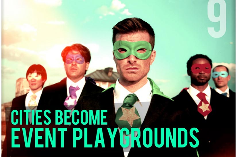
What we love:
As mentioned above, an image should enhance the message behind the slide.
In this slide content, the obvious choice for an image would be a cityscape. After all, the content is about cities becoming event playgrounds. However, we decided to emphasize the ‘play’ aspect, and went with an image that is whimsical but still ties into the idea of professionals at play – not children or spring breakers.
You want to give the same thought to the images you select. They should enhance your message yet remain slightly unexpected to hook the audience’s attention.
Inspiring Quotes for Event Planners
SpeakerHub created a fun slide deck if you love quotes. Even if you don’t, you’re bound to find some inspiration here.
What we love:
This is the type of deck that you can go through again and again. The visuals are interesting, and the quotes are pertinent to the life of an event planner. It’s also a good example of simple, varied layout.
The Definitive Guide to Event Marketing
Marketo put together a solid resource on event marketing, including topics such as event technology and public relationships.
What we love:
If you have a long slide deck, consider adding a table of contents (TOC). It’s not needed in the presentation but can really help when people are looking it over later. In this case, the slide collection is 122 slides. The TOC is a good call that makes navigating and using it as a reference much easier.
Successful Fundraising Events
Bloomerang shares study results of what makes the difference between a good fundraising event and a great one.
What we love:
Have you ever heard the old adage about learning presentations, “Tell them what you’re going to tell them. Then tell them. Then tell them what you told them.”
The idea is that repetition is often the key to learning. This slide deck starts off with 3 key points listeners should come away with. It’s a simple reminder that activates their brains early on.
20 Signs Your Event Is From 1999
Indulge us as we share another one of our presentations, but this one is just plain fun – like driving a little red corvette, you might say.
What we love:
This slide deck is all about connecting with the audience and invoking a feeling of nostalgia about the 90s. We use 90s colors and a pop culture reference to a famous Prince song. Pop culture references and time-period themes can be a great way to grab and hold audience attention.
Education Disruptors for Conferences
Jeff Hurt explains how to shake things up with your conference education sessions.
This one just sets a great tone from the very first slide.
What we love:
This slide deck uses another pattern technique by reusing the same image throughout (the one of the pointed finger) whenever it asks a question that it is about to answer. Viewers know this introduces a new moment of learning and it conditions them to pay attention to the new concept.
21 Ways to Boost Your Event
Very cool presentation by Cyriel Kortleven. He is a top master of ceremony. The emphasis here is on boosting the engagement of your audience. Cyriel shares practical tips that everyone can use to improve the audience experience.
What we love:
While this slide deck is best viewed offscreen (the layout is clean and easy to understand, but some of the font is too small from in the back row), his helpful tips earned him a spot here.
34 Essential Content Marketing Statistics to Guide You to Success in 2017
Maria Milenkova give us 34 excellent reasons/statistics of why content marketing is important.
What we love:
Her stats are easy-to-read, tweetable, and have well-documented sources, and each slide is branded. If someone takes a picture and shares it with others, it can be traced back to Maria.
Secrets to an Award-Winning Marketing Strategy for Events
This event management ppt slideshare by Krista Hauritz matches great visuals with content for good retention.
What we love:
It gives digestible bites of content so they can be absorbed easily by the audience.
20 Event Planning Fails Our Guests Hate
In this one, we created a pattern of putting a bold idea on a title slide, followed by a meatier explanation.
What we love:
It conditions the audience to first hear the idea, then pay attention to receive more information about it. This “dramatic pause” between idea and deeper explanation improves retention because it allows for smaller concepts to be processed first and then elaborated on.
EXTRA EXCITING BONUS SLIDE DECKS FOR EVENT PLANNERS

If you’re feeling a bit overwhelmed, here are some more awesome resources we’ve put together to help you plan and deliver presentations, proposals, and corporate events.
This bundle includes the following:
Free Downloadable Event Presentation Templates
The event management presentation sample is a great standalone design that you can use as a template for creating something personalized to your audience.
Corporate Event Planning Checklists
For corporate event planners, this slide deck covers each step in a successful corporate event. It’s a behemoth of a slide deck (probably the most complete in the industry).
We know it is because we based it on our corporate event planning checklist. This corporate event planning slideshow will keep you on track every step of the way.
This collection of slides is more than just a regular sales ppt. It’s an event management company presentation ppt, an event planning process ppt, and an event marketing ppt.
And finally…
Creating Winning Event Proposals Checklist
For those of you looking for winning event proposals, this bundle includes a template in both powerpoint and keynote.
ABIDE BY THE LAW WHEN CHOOSING IMAGES
We mention using evocative images in presentations a lot, but an evocative picture is the easy part. Let’s take a moment to talk about copyright. For your images, you can’t just surf the web, find one, and add it to your presentation.
Wait. What?
Images are covered under several different types of copyrights, and if you don’t know which one you have, you could be in trouble with the owner of that image.
Royalty-free. This means the image is free and clear to use. There are no royalties or license fees to pay. Royalty-free images are often available across multiple sites. For instance, you may find the same image on Pixabay and UnSplash. Some sites will ask you to credit them. If they do, you can add a small credit line directly under the picture or at the end of your presentation.
Creative Commons License. This photographer or designer has made the image available to the world for free. But you should still check the publishing terms behind using it. Often, they ask for a credit or require the image to be used in a particular way (i.e. no edits).
Public-domain. If an image is over 70 years old, it may be available to use under the public-domain. However, these restrictions vary by country. In the US, most photos taken prior to 1923 are part of the public domain, but don’t assume old photos can be used free and clear.
Always check the permissions. There are many ‘historical’ and ‘memory’ projects you can tap into, particularly if you’re looking for a particular time period, event, or place.
Now that we’ve gone over the types of licenses you should look for, let’s touch on a few phrases you may encounter:
Attribution. This is the credit you give to the photographer or artist. When someone gives you use of their photo, they may ask for a specific attribution. They may even ask for a link. If you want to use the image, you need to give credit in the way they ask.
Commercial Use. Some visual artists do not want their images to be used for commercial use. If they say the image is available for commercial use, you can use it to make money. If they tell you for non-commercial use only, you may only use it in ways that you would not derive money from it directly.
Some will stipulate non-commercial, non-editing, which means you can’t edit the image either. No changes may be made to it when using. This can include altering the colors to align with your theme.
DON’T KILL YOUR EVENT PRESENTATIONS WITH BULLETS

Recently, presenters at Google have made a switch: no more bullets.
Why?
Bullet points turn visual draws for the audience into speaker cue cards.

Google CEO
So what are they doing instead? If bullets are bad, what do Google execs suggest?
Lots of white space. It provides for a dramatic backdrop and makes things easier to read.
Bite-sized concepts or phrases are easier to digest and make a larger impression than long paragraphs. Don’t lose your audience in the words.
Evocative images. A photo conveys emotion in a much stronger more memorable way than words.
Animation or video. These options have all the engagement hype of images, but they entertain as well.
Less than average. The average person uses 40 words per slide. (This point is only 16.)
Bullets Require Multitasking
Bullets require multitasking (reading slides and listening to the presenter).
And guess what? Turns out, we’re not that good at that.
On the other hand, if you use slides as the emotional cues behind your presentation, your slides won’t be competing for attention with your speaker. The images will set the stage for the emotion you’re trying to evoke, and the bite-sized bits will give the general idea behind each concept.
Once the attendee grasps those, they are free to listen to what the speaker has to say. Their brains won’t need to choose between reading or listening.
Boost Retention (And More) With Images
In addition to giving our brains a break, it turns out images have a second benefit in presentations. They improve retention.

Brain Rules
Cognitive psychologists have tested recall after presentations that put lots of info on each slide and those that put only key takeaways.
Viewers who saw slides with fewer words recalled more than twice as many key points as those who were given more text.
Those are big retention differences.
But that’s not all…
According to research from 3M (the Post-it Note people) visuals process 60,000 times faster than text. Finally, according to the Social Science Network, 65% of people are visual learners. So giving them something to look at will improve what they get from your presentation.
Move Your Presenters Away From Bullets
We mentioned earlier what Google was pushing instead of bullets, but how can you help your speakers make the transition? Here are a few quick tips:
Give each point a slide. They deserve it. Bullets denote major points, right? Why not give them each their own slide? Yes, that means more slides but it also means more visual interest and faster slide changes, which will keep the audience involved with their eyes on your screen.
Kill your darlings. Writers will tell you the hardest part of editing is removing your favorite pieces (“killing your darlings”), but if they’re not absolutely necessary, get rid of them. They’re just taking up space and detracting from your message.
Be unique. Bullet points are so boring. Everyone does them. And let’s face it, they’re easy. Who doesn’t love their entire presentation scripted for them so they can just read it right off the screen?
The audience, that’s who! Instead, try minimal words that engage the minds of your audience.
Find a TED talk in your industry. If you watch TED talks, you’ll notice there’s no reading off of Powerpoint cue cards. It’s all about the stage presence. Share a favorite talk with presenters so they understand what you’re looking for.
Remind them bullets don’t build rapport. If someone makes you laugh or feel at ease, you respond favorably to them. This can’t be done with a fat, floating period. If your presenters want to connect with the audience, a lot of words on screen isn’t the way to do it.
Use slides as jumping off points. Encourage your speakers to use commanding visuals on their slides as jumping off points for conversation.
Help presenters be the best they can be. Offer templates. Be open to discuss design with them, or put them in touch with someone who can help. Remember, your presenters may be subject matter experts, but they may need a little help when it comes to the features of Powerpoint or the aspects of design. They may have a creative idea but are afraid to try the tech behind it.
IN CONCLUSION
There’s a lot that goes into a good event presentation and we’ve given you plenty to think about and some handy templates and examples to start you off.
Now onto you:
- Do you have a tip to make this page better? Send an email to [email protected].
- Do you have more tips and advice to add about creating awesome presentations? Comment below.
- Do you have a colleague who may benefit from reading this page? Share it with them.