name badge.")
It’s small, but its presence is oh so mighty. Ladies and gentlemen, we present the name badge, the unsung hero of an event. The name badge is one of the most essential material pieces at any event. Simply put, a name badge is the place to put attendees’ names and information so they can be identified easily by event staff, and most importantly other attendees.
Don’t be fooled by this simple definition. It may seem easy, but there are many different factors at play when designing a successful name badge. Don’t stress — this is name badge boot camp, where we’ve outlined everything you need to know about creating a clear (and fun!) badge for your event.

Identify your goals, and keep them in mind.
There are two big goals for an event name badge that you should keep in mind when beginning your design. The first is to provide information about attendees wearing the badges. The second is to encourage networking opportunities between attendees, speakers, and anyone else at your event.
Networking is one of the biggest draws of an event. Attendees want the ability to identify other key players quickly and get their conversations rolling as soon as possible — time is of the essence! This is where the power of the name badges truly shines.
Name, job title, and company info, are important pieces of the puzzle for attendees looking to network with the right people. Having this information easily visible on badges also helps event organizers and staff easily identify who is part of the event, and who is not– no more event crashers during your cocktail hour!

Keep the name as the focus.
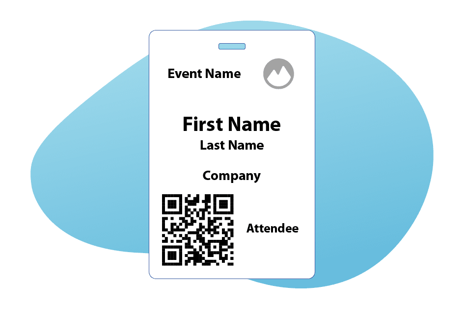
When starting the badge design process, the focus should be on the name and its placement. Typically, a name badge will house both the first and last name of the wearer, but the first name is actually the most important part.
A good quality badge will allow for the attendee’s first name to be visible from a distance (think about 10 feet away). As we mentioned, this lets others quickly recognize who’s who around the event for networking purposes, and also allows someone to quickly remember a name they may have forgotten from a previous introduction. Plus, if you’re one of those who are bad with names, this is a great perk!
To keep the name as the main focal point, we recommend placing the first name near the top of the badge on a line of its own. This text should be the biggest of all other text, making it the most prominent feature of the name badge. This will instantly draw the eye in, and immediately bring it to the most necessary information. Then the last name should appear on a line of its own under the first name. The last name should never be as large or as bold as the first. And yes, it’s true, “If you ain’t first, you’re last.”
Use that space smartly.
Yes, that’s right, the person’s name on your name badge should be more prominent than your logo, or even any custom event artwork. Considering the badge is most likely about 4”x6”, the space on it is truly precious real estate.
The truth is, attendees know where they are and what event they are at. They don’t need to see the logo or event name on every badge from far away. While event branding does have its valuable moments, less can be more when it comes to name badge designs.
So the lesson here, use that limited space to promote the information your attendees might not know yet. We promise that they can always glance down at their own name badge if they want to see the event logo more closely.
The QR is the (other) star.
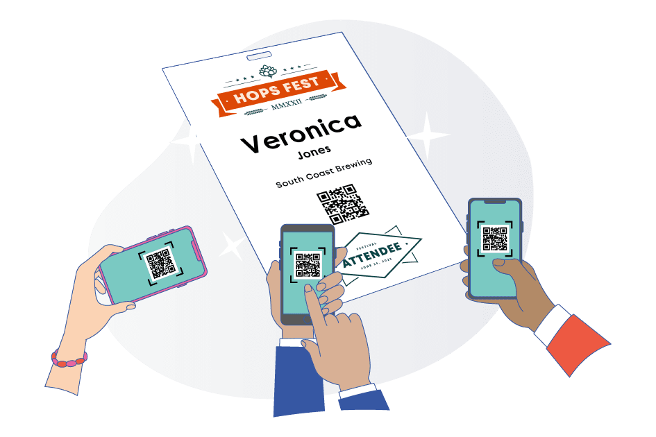
Okay, so the name isn’t the only star of the name badge show. After the attendee’s name, a QR code should be the second most prominent item on the badge. Events that use QR codes give their badges the next level of usefulness.
The badge does more than just give attendees valuable information about one another. Adding a QR code to name badges will allow for event session attendance tracking and exhibitor lead retrieval!
Introducing another prominent item can be tricky. You want to make sure you don’t have the two pieces competing for space, so it’s best to have the QR code near the bottom of the badge. This way, there is no competition, and the badge feels more balanced.
Just like the name, the QR code should be a size that allows them to be scanned from a distance. We suggest at least ¾”. No one wants to get up close and personal every time they need their badge scanned so making it a scannable size is a must!

Know what not to do.
With the “do’s” come the “don’ts” when designing a name badge for your event. There are things you want to always avoid.
We’ve already mentioned that making the last name larger than the first is a no-go, as is placing the attendees first and last name both on the same line. But, there are still a couple other things to keep in mind.
Again, less is more in many of these designs. You shouldn’t add fancy hard-to-read fonts to attendee’s names or other information. Sticking with a font like Ariel or Open Sans will prove to be much more bold, clear, and easy to read.
You also don’t want to use too many lines or colored borders around the information. You want it to flow like a story, not like many different snapshots.

Don’t be afraid to spice it up.
Name badges don’t have to be boring to work well. A great way to add some spice to your design while keeping it simple is to use the space on the back!
This is an opportunity for your marketing team to have some fun. If you’re using a badge with a single notch in the middle, chances are that it’s going to swing around throughout the day. You don’t want to miss out on all that space.
Rather than just have a blank badge staring someone in the face, add your custom-designed event artwork. Or better yet, sell this space to the highest bidder — sponsors will pay for this prime space, and it will add some fun flair to your badge. Win-win!
Spinning badges not your thing? You can still make use of this back-side space without using it for artwork or advertising.
On badges with two notches, the back can still house some added fun branding or a simplified agenda for the attendee to reference! Or, if you know the wi-fi password for the venue, this is a great place to include it along with the Event Organizers contact info. This would also be the perfect spot to feature your event hashtags, the options are endless. #WIN
Most importantly, have fun with it!
While keeping these best practices in mind, don’t forget to have fun with your badge design!
There are tons of opportunities to showcase the personality of your event on the name badge while keeping the information clear and easy to read for your attendees. It’s all about finding the balance between what works best for you and your event. Now you know what to do, time to get to designing!
Interested in having easy customizable badges at your event? Learn more about Expo’s Check-In and Badge Printing features here, or send us a message at info@expopass.com.